

Key 🇬🇧
A brand identity and social creative system for a UK consumer products brand — built to unify a genuinely varied product range under one recognisable look.
How we got there.
01 The Challenge
Key is a UK-based consumer brand selling across a genuinely varied set of product lines, from home comfort items to seasonal treats. That variety was a strength commercially, but a risk visually — without a defined logo and colour system, campaigns for such different products risked feeling like they belonged to different brands entirely, weakening recognition every time a customer moved from one product post to another.
02 Research
We looked at how the brand had presented itself so far and where the visual inconsistency showed up most — across logo usage, colour and typography — to define what a single, flexible identity needed to hold together.
03 Strategy
Build one brand system flexible enough to sit behind any product category the business sells, so recognition builds with every post regardless of what’s being promoted that week.
04 Design Process
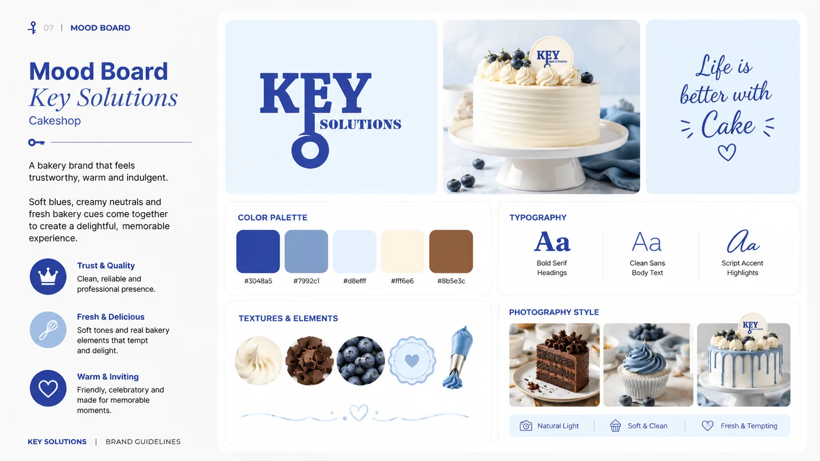
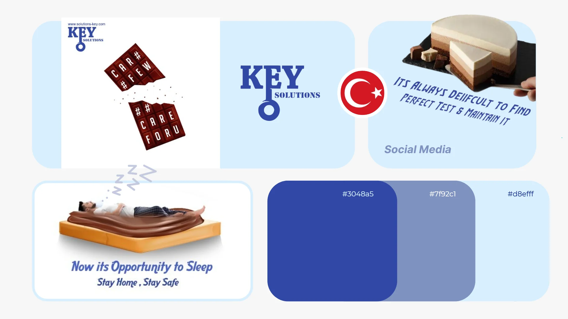
We designed a distinctive key-mark logo lockup and a structured three-tone blue palette — a confident deep blue, a muted mid-blue and a pale sky tone — built to anchor every future piece of creative.
05 Development
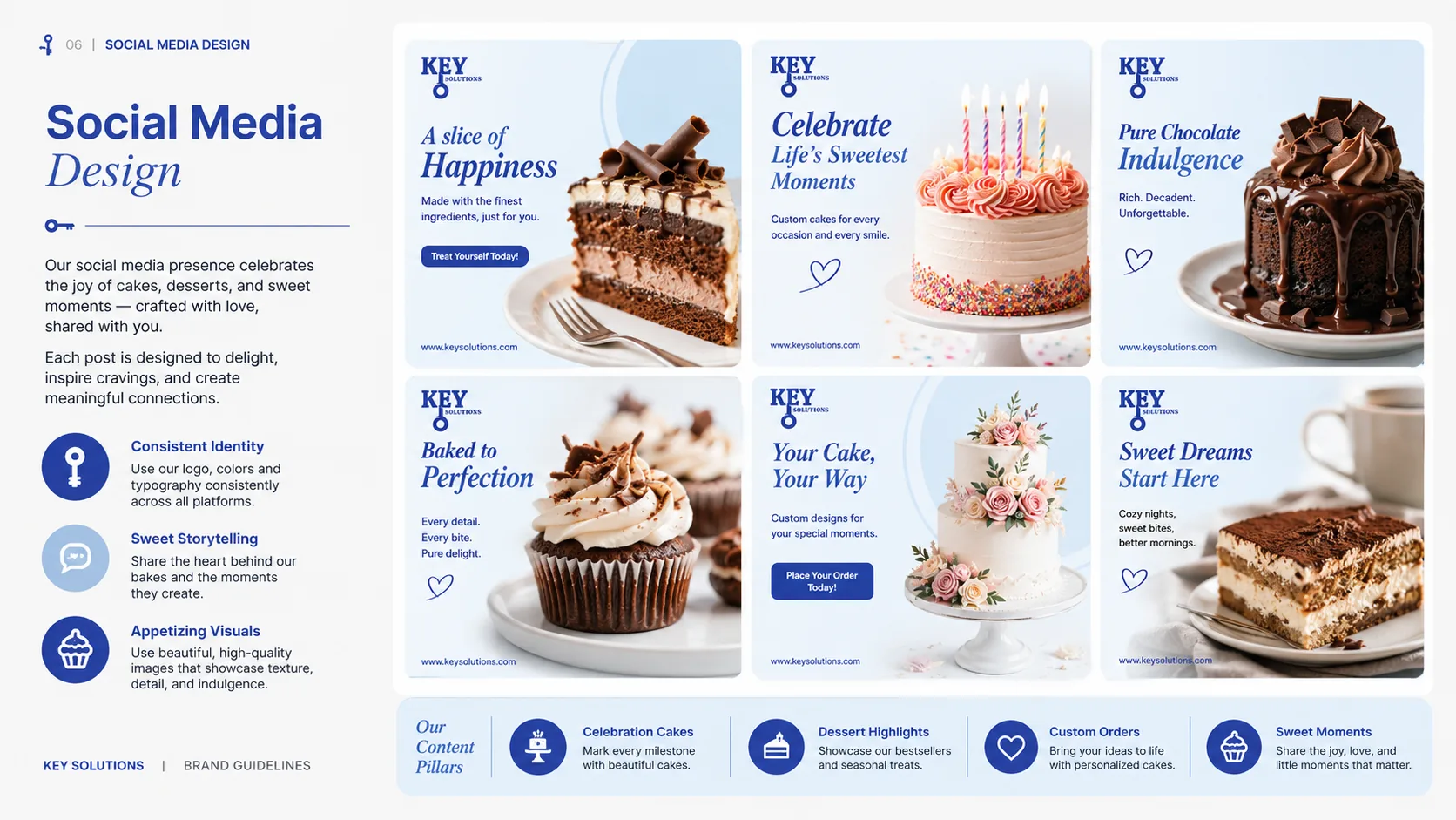
The identity was translated into a set of social-ready creative templates, applied consistently across the brand’s different product campaigns so each one still reads as unmistakably Key.
06 Marketing
With the system in place, Key could roll new product and seasonal campaigns out quickly, confident that the brand would stay recognisable no matter which product line was in focus.
The exact process, step by step.
From a fragmented look to one recognisable brand.
Discovery & Understanding
Reviewed Key’s existing creative across its different product lines to identify where consistency was breaking down.
Brand Identity Design
Designed the key-mark logo and defined the three-tone blue palette that would anchor the brand going forward.
Social Creative Templates
Translated the identity into ready-to-use templates for the brand’s different product campaigns.
Testing & Optimization
Applied the system across genuinely different product types to confirm it held together visually in every case.
Final Delivery
Handed over the full identity system, ready for Key to apply across future campaigns.
What we brought to the table.
What was built.
Custom Logo Mark
A distinctive key-inspired logo lockup built for instant recognition.
Defined Colour Palette
A structured three-tone blue system used consistently across all creative.
Social Creative Templates
Ready-to-use layouts applied across the brand’s different product lines.
Cross-Category Flexibility
A system proven to work across very different product categories.
A closer look.
The outcome.
Key now has a single, recognisable brand foundation that holds together across a genuinely varied product range, replacing a fragmented look with one consistent identity.
- A unified, recognisable brand presence across varied campaigns
- Stronger brand recall from a defined logo and colour system
- A consistent visual foundation ready for future campaigns
- Faster creative production from a reusable template system
Want results like this?
Let's talk about what a similar engagement could look like for your brand.
Book a Strategy Call