

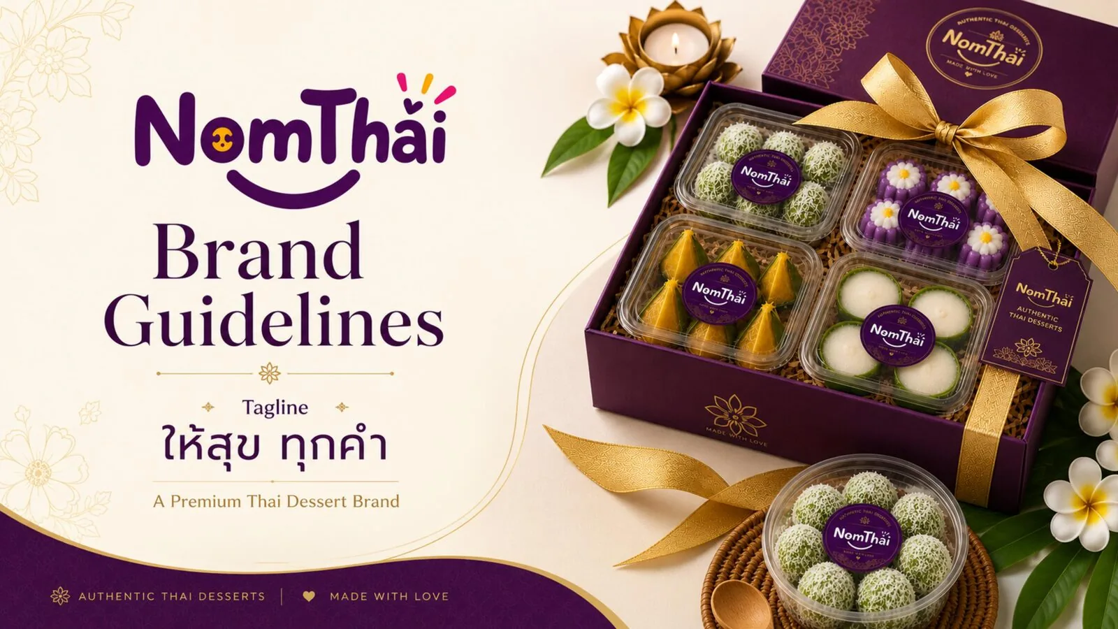
NomThai — Building a Distinctive Brand Identity 🇹🇭
Creating a memorable visual identity that brings NomThai's personality, positioning and experience to life.
Creating a Recognizable Brand
NomThai needed a distinctive and consistent visual identity that could communicate its personality across every customer touchpoint.
Brand Recognition
A look customers could recognise at a glance, on shelf or on screen.
Visual Consistency
One identity that holds together across every application.
Brand Personality
A visual voice that feels distinctly NomThai, not generic dessert branding.
Distinctive Identity
A mark that stands apart from both heritage vendors and modern chains.
Customer-Facing Experience
An identity built to work everywhere a customer actually meets the brand.
Brand Personality
Authentic
Rooted in real Thai dessert-making traditions.
Modern
Presented with a clean, contemporary visual finish.
Welcoming
Warm, friendly and easy to feel good about.
Distinctive
A character of its own the category doesn't already have.
Visual Identity
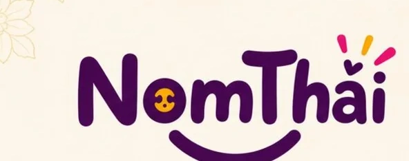
The NomThai wordmark.
A hand-lettered, rounded wordmark paired with a smiling face motif — friendly and distinctly non-corporate, built to read clearly at both packaging scale and social-feed thumbnail size.
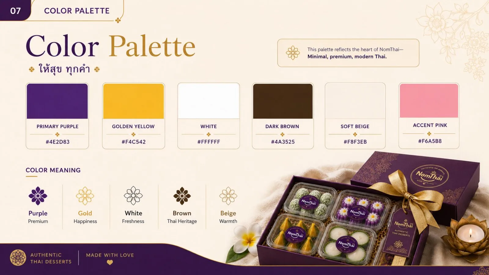
Minimal, premium, modern Thai.
Primary Purple and Golden Yellow carry the brand, with White, Dark Brown, Soft Beige and Accent Pink as supporting tones — each colour tied to a specific meaning, from heritage to happiness.
A voice as warm as the wordmark.
The identity's type feel is set by the logo's own rounded, hand-lettered lettering, carried through in a clean, friendly sans-serif for supporting text across applications.
A full standalone type-specimen sheet isn't part of the exported guideline assets yet — typography is best seen in context across the Brand Applications gallery below.
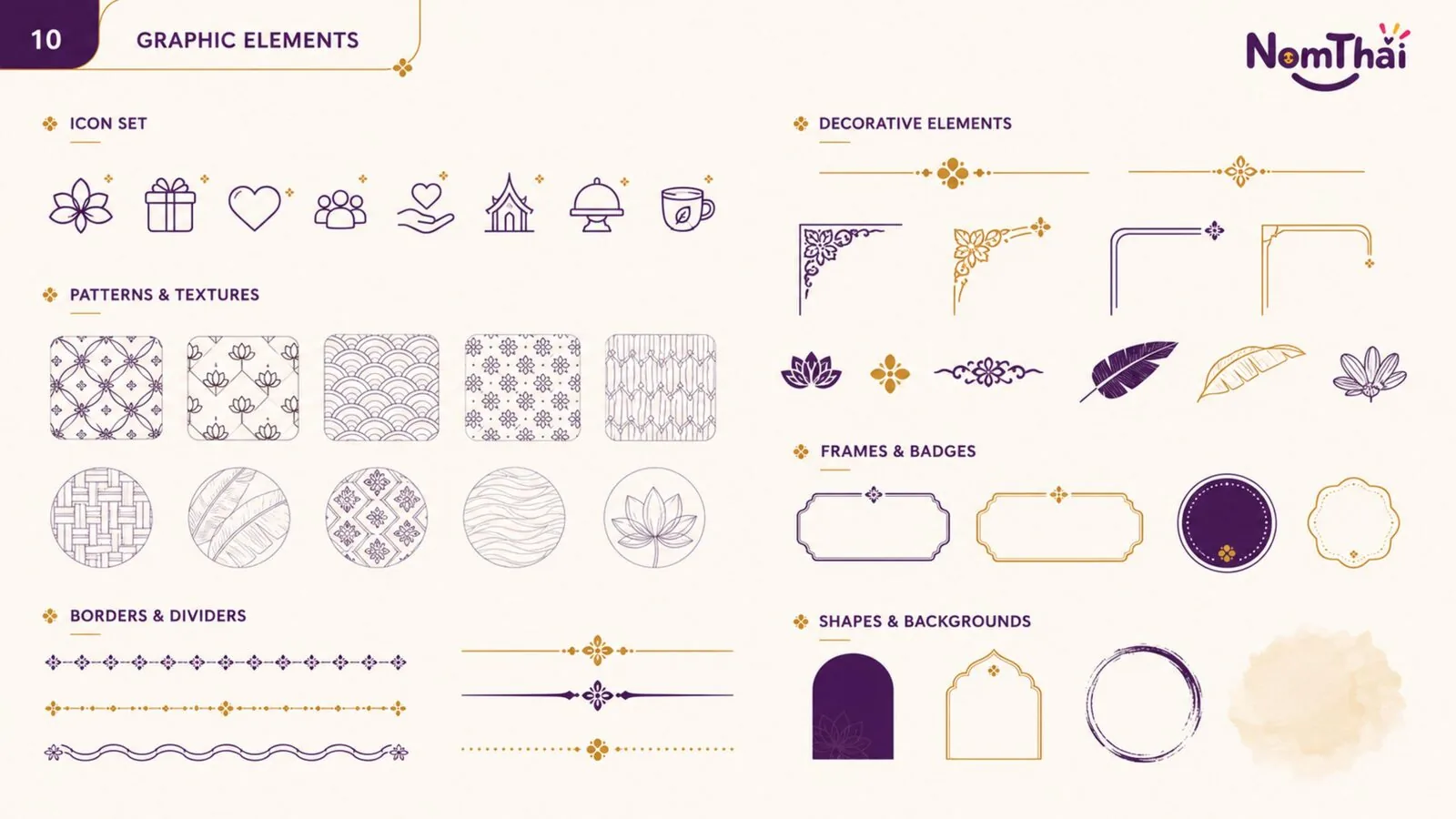
Patterns, icons and decorative marks.
A supporting library of icons, lotus and floral patterns, corner flourishes, frames and badges — Thai-inspired decorative elements that dress up applications without overwhelming the core identity.
Bringing the Brand to Life
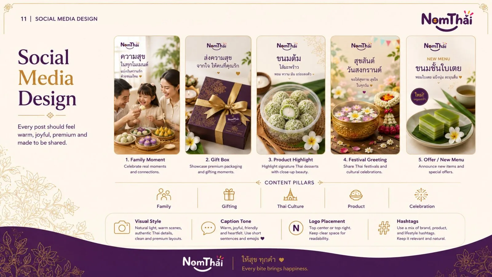
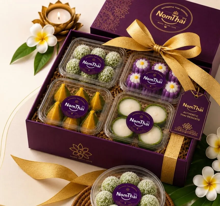
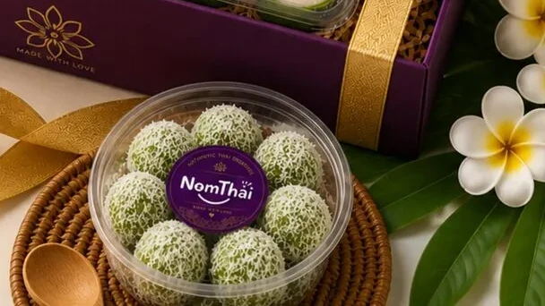
The identity carried into packaging, social content and everyday product presentation.
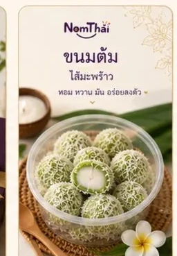
Brand Guidelines
Logo Usage
Clear space, minimum size and approved lockups.
Color System
Primary and supporting tones with usage ratios.
Typography
Wordmark lettering paired with a supporting sans-serif.
Imagery
Natural light, warm scenes, authentic Thai details.
Graphic Elements
Icons, patterns, frames and badges used consistently.
Layout Rules
Logo placement, caption tone and hashtag conventions for social.
The full guideline spreads behind these rules are shown in the Branding Gallery below.
One Identity. Every Touchpoint.
The same logo, colour system and graphic language carry through everywhere NomThai shows up:
Brand Outcomes
Consistent Visual Identity
One system carried across every touchpoint.
Stronger Brand Recognition
A look customers can identify at a glance.
Distinctive Brand Personality
A character that stands apart in the category.
Cohesive Communication
Messaging and visuals that reinforce each other.
Professional Brand Presence
A system ready for gifting, retail and social contexts alike.
Consistent Customer Experience
The same brand feeling wherever a customer meets it.
The identity system, in full.
Real spreads from the NomThai brand guideline, plus product and social applications.
Pairs well with Branding.
Ready to Build a Brand People Remember?
Let's create a distinctive identity that makes every brand touchpoint feel unmistakably yours.
Let's Talk